Now that this year’s Clerkenwell Design Week has come to an end, here are some of the noticeable trends from across the exhibitions and installations. Along with some personal highlights from LJMU career accelerator intern, Caitlin Allan.
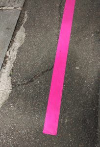
The Famous Pink Lines
As a soon-to-be English graduate it’s true to say that i’m more likely to be found with my nose buried in a good book than at the cutting edge of global design! But as an LJMU career accelerator intern, I was given the opportunity to become a first-time visitor to the award winning Clerkenwell Design Week, which this May, returned to London for the eighth year in a row. Set over three days, the festival attracted over 30,000 attendees, cementing its position at the heart of both national, and international, design. I was excited to glimpse at first-hand – and now to share – some of the most exciting trends that will be coming to you soon!
The Ideal Office Space
We’ve all been there – you have a heavy workload, a fast-approaching deadline to meet, you need to focus and Sheila decides to call her best friend on speakerphone while the guy on the desk opposite opens a family-sized bag of doritos! Clerkenwell has the answers to your prayers…
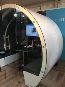
Many of the exhibitions throughout Clerkenwell Design Week promoted an idyllic working environment and included products designed to create a more relaxed and harmonious atmosphere. Companies such as themeetingpod.co and Framery, exhibited products with a particular focus on aiding concentration and inspiring productivity with both their Meeting Pod and Framery Q ranges. With specialised interiors, which minimise background noise the aim of the pods is to provide a space that motivates focus and the exchange of ideas. Hallelujah!
This idea of intimacy and private space was also highlighted in the Cube Spaces installation and their Lagoon Solo Workpod, which aimed to rescue employees from the busy hustle and bustle of the typical office environment. Their Workpods feature a power module, and an adjustable overhead light, creating a quiet and compacted work station.
BuzziSpace presented a different approach to the alternative working environment in the form of their ‘BuzziJungle’. Designer Jonas Van Put has created the ‘vertical conversation tower’, a climbing frame-like structure that promoted a comfortable and social meeting space. There was also the added element of fun to the frame, which invited people to climb the tower – who could get tired of legitimate monkeying around?!
The Environment
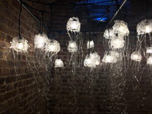
Ever important and a theme close to Liight’s heart, the concept of eco-friendliness stood out amongst the many brilliant exhibitions on display, with the issue of sustainability being a key inspiration for a lot of the products throughout Clerkenwell. Designers such as Claire Potter Design, and Yvonne Slough from MySlouch, presented some fascinating pieces at the ‘Platform’ exhibition, expressing their passion for the environment and renewable materials. Claire Potter’s debut at Clerkenwell Design Week 2016 introduced her use of recycled debris with her ‘Ghost Gear chandelier’, made from used fishing nets. This year her environmental agenda reached a new level – with her LED lit ‘Smack’ of 30 Jellyfish, crafted out of 365 disposed plastic bottles collected from Brighton Beach earlier this year.
MySlouch also returned to Clerkenwell this year, after a great reception at last year’s show, where the launch of their glow in the dark bean bag met with great success and stellar reviews. This year was no exception, as their Glowinthedark lamps received a great deal of interest. Particularly inspriring was their eco-friendly and light pollution-free technology, allowing them to continue glowing once the external power source had been removed.
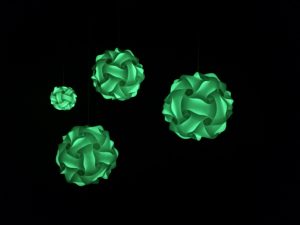
Japanese design company DI CLASSE presented their beautiful and sustainable Paper-Foresti lighting products, which offers a chance to appreciate nature from the comfort of your own home. DI CLASSE pride themselves on using “Air clean paper” to create their work, a material that is claimed to clean the air, like that of natural plants. This in itself, promotes a clean and therapeutic living environment with the use of a ‘Photocatalyst’ chemical reaction that seeks to offer nature a helping hand by purifying the environment.
Highlights
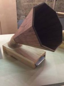
For me personally, one of the highlights of Clerkenwell Design Week 2017 had to be the Resound collection by Camilla Lee. Her exhibition included what she called ‘organic amplifiers’, which aimed to put the warmth back into listening to music and removing the highly-distorted experience that you may get with electrical speakers and docking stations. It is said that the series ‘enhances the iPhone’s music through natural materials’, which positions it well against the environmental trend discussed earlier. It makes it the perfect way to listen to music – removing the need for cables or electricity.
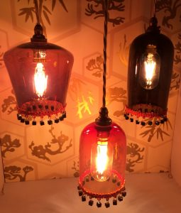
Another highlight was the installation provided by curiousa&curiousa, who specialise in hand-blown glass lighting, creating beautiful and elegant pieces that really stand out. The design and colours are described as ‘Baroque opulence’, and I really liked the elegant fringing additions on their ‘Caravaggio’ collection.
Never having been to Clerkenwell before, and as a relative novice to the design world, I didn’t know what to expect from my first visit to Design Week. I really enjoyed my day at the festival… now all that’s left to do is to kick back on my glow in the dark bean bag, in my pod, listening on my environmentally sustainable amplifier!
No comments yet.